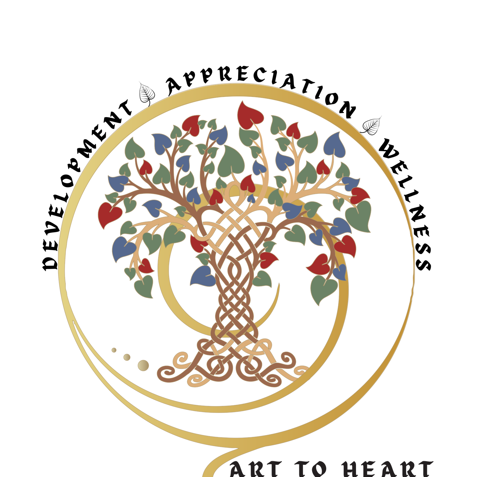
Art to Heart Institute- As i sat on the drawing board trying to encompass this broad & beautiful vision of Uma ji it got me thinking. Art of any form stems from roots, it has a lineage, a legacy. As the saying goes “AS ABOVE, SO BELOW”. This beautiful tree of life represents that, the roots and the foundation laid by our eminent Gurus through which we grow. The tree itself is knotted in several ways representing that art is so interconnected with life. The various forms of art all intertwined to create beauty & aesthetic, branching into several avenues & paths, blossoming into leaves as students/collaborators with the constant nurturing from the roots. Thus establishing our values of Development & Wellness.

We have used the pipal leaf considered to be holy in Sanatana Dharma – the shape representing the heart. A very thought provoking suggestion by one of our Gurus who enlightened us with a story graced in the Voice of God by his holiness Jagadguru Shri Chandrasekharendra Saraswati Mahaswamigal.
“What does the Upanishad say? “There are two birds sitting on the Pipal tree. One eats the Pipal and the other keeps looking on without eating’ says the Upanishad. The body is that tree. In that tree one thinks himself to be Jīvāthmā and eats the fruit viz. the experiences through the senses. He is one bird. In the same body there is Paramathmā as another bird. He is the one who moves Jīvāthmā to act. But He does not move. He keeps looking at the action of the Jivan and remains a witness. Although he is the support to the Jīvā, he does not experience through the senses does not eat the fruit and does not experience the fruits of action. The Upanishad explains this in a poetic manner with the metaphor of the birds and the fruits. One who eats is the Jivan. One who does not eat is the ultimate truth- One who has realized that he is the Athma. The use of Pipal leaf in our logo endeavours to represent this deep philosophy of self realization.

The third value of our institute is Appreciation. Encompassing the tree of knowledge & the holy leaves is the universal symbol of appreciation & thankfulness.
The colour pallete of our institute :

Deep Indigo or Midnight Blue: Representing depth, excellence, and the boundless nature of creativity

Muted Gold or Warm Terracotta: Symbolizing appreciation, tradition, and the transformative power of creative expression.

Sage Green or Soft Olive: Evoking well-being, growth, and a harmonious community.

Maroon: Tradition
And thus is born, The logo of Art to Heart Institute!

Thankful for the opportunity.
Prarthana Akhil Designer


